Grab the code in GitHub: https://github.com/pnavk/nextjs-rsc-modal-dialog-example
While working on an application using Next.js App Router and React Server Components, I needed to open a modal from two different places:
A button on the home page
A link on the navigation bar
With Next.js Pages router this would be trivial. The necessary state would need to be lifted up to the most common ancestor and then passed through as props. With RSC, this approach no longer works because the navigation bar is at the root layout of the application and the modal itself is much deeper in the tree. We can’t lift state up because it would end up turning all our components into client components.
We need a way to manipulate state in any child component without passing props 🤔
Note: I am using the Dialog component from the excellent shadcn/ui component library.
One way to do this to is to pass state through the URL. Specifically, the modal component could use the presence of a specific query parameter to show or hide itself. Let’s outline some goals for the implementation:
We must be able to toggle the visibility of the modal through the URL and without passing props.
We must preserve the native back-button behavior of the browser. Showing/hiding the modal should not alter this behavior.
We must preserve animations for showing and hiding the modal.
We must preserve the behavior of the
DialogTriggerandDialogClosecomponents that come packaged with theDialogcomponent from theshadcn/uilibrary.We must be able to share a link to the modal externally and the modal should render when users arrive to the site by clicking the link.
We must be able to easily toggle the modal open or closed from anywhere by simply using a link.
With our goals defined, let’s dive in.
Step 1: Define our Modal Component
We will begin by creating a Modal component. This is a higher order component that can be reused across the entire application and encapsulates the behavior of showing or hiding the modal.

Let’s break down what is going on:
Our
Modalcomponent takes 2 props, arouteNameandchildren. TherouteNameprop defines which query parameter to look for to determine if the modal should open or close.We declare a
useStatehook to manage the open state of the modal.We get all the query parameters in the current route through the
useSearchParamshook innext/navigationWe set
constisOpen = searchParams.has(routeName)to determine if therouteNameis in the current list of query parameters or not.We define a
useEffecthook which runs each time the value ofisOpenchanges and use the value ofisOpento set the state of the modal.Why a useEffect? If we don’t use an effect, when navigating to the route directly (via a sharable link) we get a hydration mismatch error. Using an effect ensures that the modal is only opened after the initial render.
We declare a function to listen to the Dialog component’s
onOpenChangeevent. When theopenstate becomesfalse, we replace the current route with the value returned from theusePathnamehook. This returns the current URL, without anyqueryparameters (e.g.localhost:3000/?hellowould return'localhost:3000/')When the open state becomes
true, we append therouteNameas a query parameter to the current route. (e.g. isrouteNameis defined ashellothenlocalhost:3000would becomelocalhost:3000/?hello)This ensures that clicking the
DialogTriggerandDialogClosebuttons modify the current route as necessary, which triggers our effect, which shows or hides the modal.
Note: We use
router.replacewith a value ofscroll:false- this is important:router.replacepreserves the native browser back button behavior because it doesn’t add the URL changes to the browser historyscroll:falseensures that when the modal is opened or closed, the page doesn’t suddenly scroll to the top, which is the default behavior when navigating to a new route in Next.js.
Step 2: Create a dialog using the Modal component
With our Modal component ready, lets use it to create a dialog.

Let’s break down what is going on:
We first define a
RouteIdentifiercalledshow-infothat will be used to determine if the modal should open or close. If our URL containsshow-infoas a query parameter, that will trigger the modal to display.We use our
Modalhigher-order-component and pass if theRouteIdentifierand the necessary children.
When we navigate to the url localhost:3000/?show-info our modal dialog will appear. When show-info is removed from the URL, the modal is closed.
Step 3: Open the dialog using a link
We want to be able to toggle the visibility of the dialog using a link. Lets create a component that we can reuse to help us do this throughout our app.
We will create another higher order component by wrapping the Link component from next/link
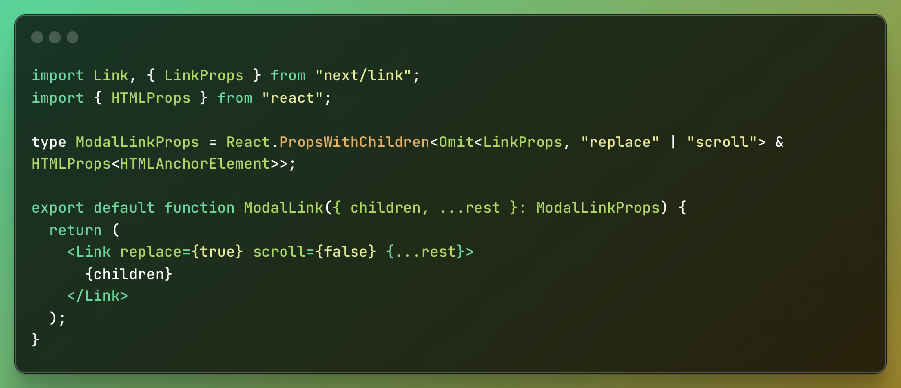
Our ModalLink component is pretty simple. It wraps the Link component from next/link and simply sets the values of replace to true and scroll to false.
This is the same thing we did in the Modal component, when calling router.replace. This ensures that the browser back button behavior and scroll position is preserved regardless of if the dialog is opened using the DialogTrigger button or through a Link.
Step 4: Putting it all together
Now its time to put it all together. Let’s setup a navigation bar that contains an Open Dialog button:

Our NavigationBar component is pretty simple. We use the ModalLink component we created earlier and set the href value to ?show-info to indicate that when pressing this link, we want to add the show-info query parameter to the current path.
Now lets create our root layout:

layout.tsx
Our root layout contains our navigation bar.
Lets create our page:

Our page simply contains the InfoModal that we created earlier. This will render our DialogTrigger button.
Demo:
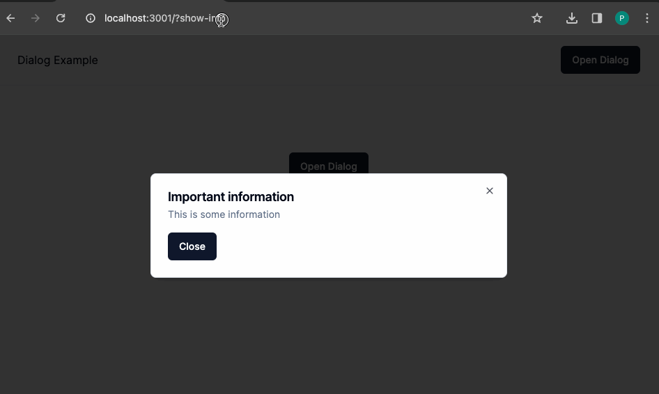
demo